These last few weeks, I've been focusing on the Puzzle of Life. This means learning
Unity, starting on a coding framework to support Puzzle play on tablet devices, searching Flikr and
Wikimedia for high quality wildlife photos to use in the Puzzle, and thinking about symbology.
The Puzzle is about flows of matter and energy, and using those flows to model the real-world networks of nature and life. The idea is that players will match outflows to inflows, and thereby create healthy and stable ecosystems. I want to be able to get across this idea to players without using words, and that requires good symbology.
In playtesting, when folks first sit down to the Puzzle, about half initially try to match like to like, matching ins to ins and outs to outs. As they do this, most wear a puzzled look, so they clearly know that something is wrong, and a 'feels wrong' experience makes a bad first impression. This is a problem of symbology.
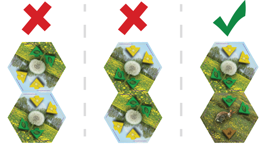
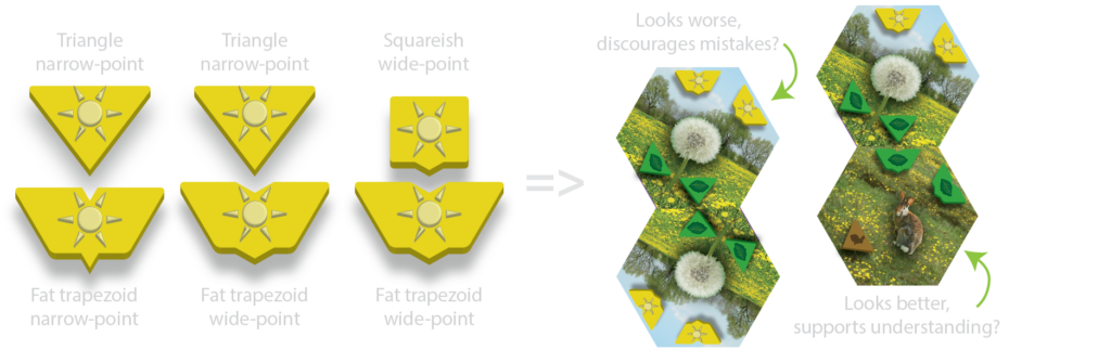
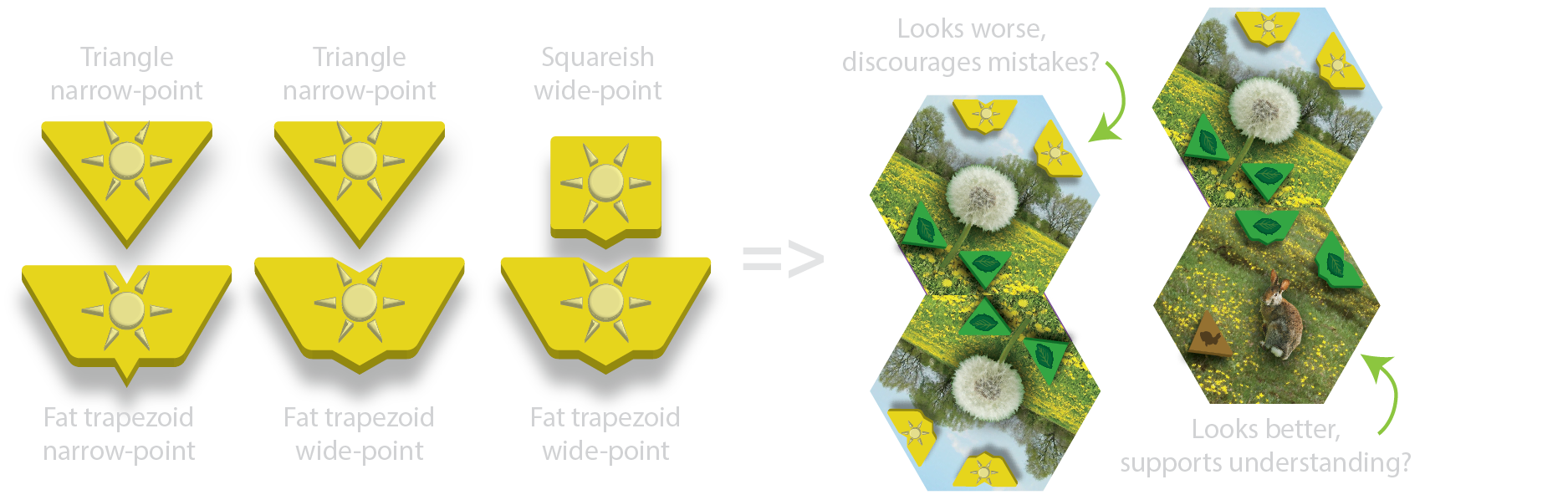
What could I do to improve this situation? Well, there's no getting around the need to use some symbols multiple times. If you have two tiles that both export foliage, then both will have the exact same "foliage out"-styled arrow. One thing I
can do is to make the out-arrow shape be different from the in-arrow shape, and make it so the shapes look like they ought to fit together. Having this sort of visual lock-and-key symbolism may make it more intuitively obvious that players should match outs to ins, rather than likes to likes.
One of the things I've been doing is playing around with arrow shapes, and while the lock-and-key idea sounds good, and the shapes look good in closeup, when printed at actual size on actual tiles, none of my new designs seems particularly much better than the original:
So, I'll keep at this till it feels right, till a solid majority of first-time Puzzlers intuitively get it.
 So, I'll keep at this till it feels right, till a solid majority of first-time Puzzlers intuitively get it.
